A Name Like No Other
How did AMERIND get its name? AMERIND is derived from “American Indian.” It is who we are and who we serve. Until recently the full name of our company was “AMERIND Risk.” But why was “Risk” dropped from our name? The full name of our company is AMERIND Risk Management Corporation, so “AMERIND Risk” was used for the majority of our history. In 2019, leadership decided to drop “Risk” from our name because our mission. Our mission in Indian Country now encompasses much more than mitigating risk. Our highest priority will always be providing financially sound, culturally sensitive insurance products, but our reach extends more broadly into the day-to-day lives of the people we serve.
A Logo Steeped in Tradition
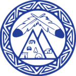
The original AMERIND logo was created as an “offspring” of the National American Indian Housing Council’s original logo (bottom right). The two triangles inside the logo represent AMERIND Risk Management Corporation and the National American Indian Housing Council working together to provide a blanket protection for their members. The eagle feathers represent prayers for safe and prosperous operations of both organizations and their members.
The triangles in the border represent communication, relationships and cooperation between AMERIND, each of the AMERIND regions and NAIHC.
The AMERIND logo was created by Joseph Laban (Hopi), a long-time advocate of safe and decent housing in Indian Country. Mr. Laban served on the Board of Directors for AMERIND Risk Management Corporation and the National American Indian Housing Council. The original logo is still used today as a graphic element to represent our strong history and tradition. The goal when designing the revised AMERIND logo was to strike a balance between clean, modern and professional with a style that’s culturally identifiable and uniquely portrays ‘AMERIND’.

- The typeface is simple, bold and clean. It remains easily readable throughout multiple formats. It incorporates more modern style compared to the previous logo by including slight flourishes on the letterforms without deviating too far away from the previous logo, maintaining familiarity.
- The identifiable mark is the letter ‘A’ from ‘AMERIND’ represented by an arrowhead. The arrowhead symbolizes watchfulness and protection, two core principles which describe AMERIND.
- The arrowhead mark can stand on its own while simultaneously depicting AMERIND through its use of the letter ‘A’.